Design for knowledge, communication, and experiences.
Online Store
Products
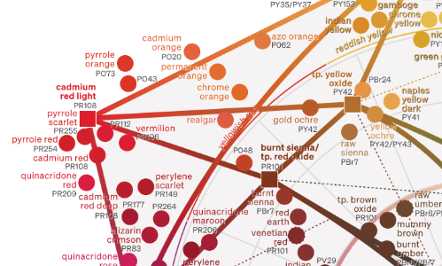
Colour Wheel and Mixing Guide
Oil Paintings
Simple Science Fitness
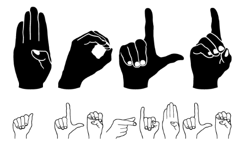
Handtext